Tracking Analysis Results through Time as 3D Graphics
One of the most popular analysis methods for time/frequency analysis is a Time-FFT. You can perform this analysis in SIGVIEW automatically to view how signal spectrum changes through time. The result is a 3D graphic with time and frequency as X/Y axes and signal amplitude on a Z-axis. This function simply divides your signal into possibly overlapping segments, calculates FFT for each segment, and places all FFT results next to each other in a 3D graphic.
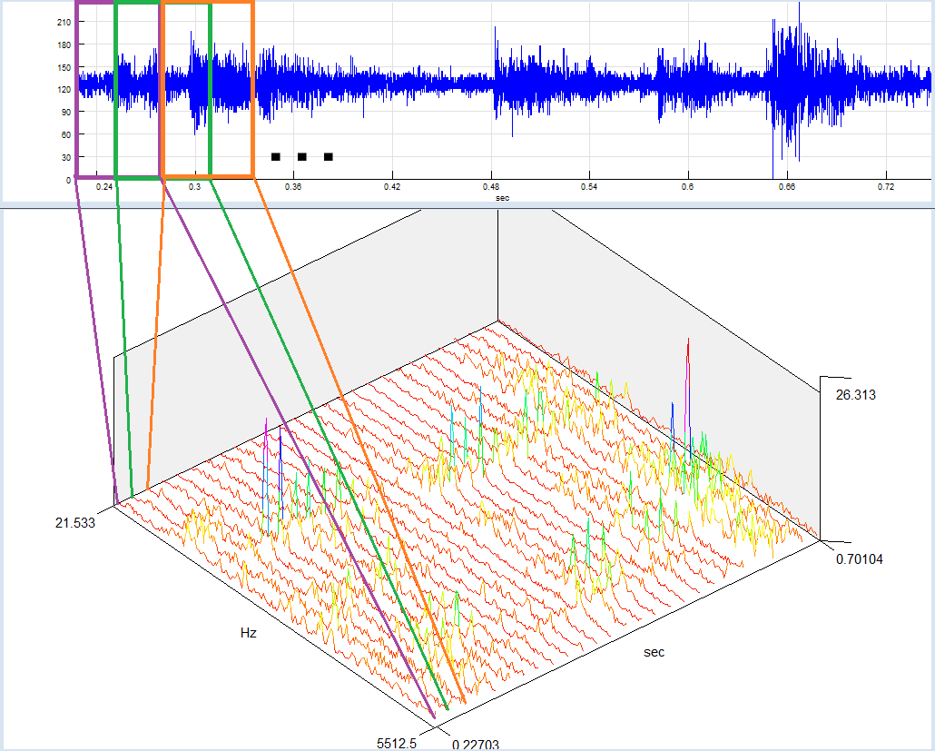
1. In this How-To guide, we will show you how to apply the same concept to other analysis functions and to observe how, for example, probability distribution of a signal changes through time. Of course, you can use the same method to track any other function, for example autocorrelation, integral curve...
2. As a first step, you should load one signal in SIGVIEW, for example, guitar.wav from the Examples subdirectory of the SIGVIEW installation directory. Of course, you could apply the same method to a live signal too.
3. Zoom-in to a smaller part of the loaded signal by using the "Edit/Zoom to X samples/values" menu option (![]() ). Choose a 1024 sample length.
). Choose a 1024 sample length.
4. Use the "Signal tools/Probability distribution curve" menu option to calculate distribution curve for the zoomed signal part (use 50 bins for the distribution curve).
5. Click on the new Distribution curve window and select "3D Tools/Track changes as 3D graphics..." from the main menu. In the settings dialog, leave the default value of 50 for "Last changes to track option". That will be the number of columns in your 3D graphic. The resulting Control Window should look like this:
6. Click on the signal window and then click on the "Play" button in the toolbar (Play & Navigate/Play (no sound) menu option). Your visible signal part will move through the whole signal, the distribution curve will change/recalculate and add a new column to the 3D graphic on each change. The speed of movement is determined by the Step property of the window which can be changed by using the "Play & Navigate/Step change... option". At the end, the last 50 changes of the curve will be stored in a 3D graphic. The result will look like this:
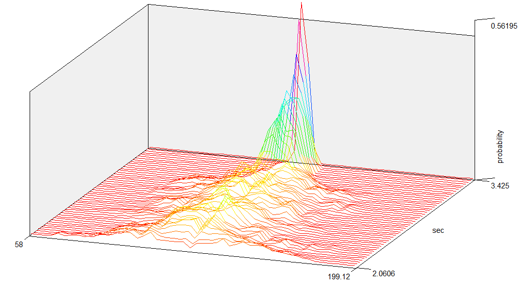
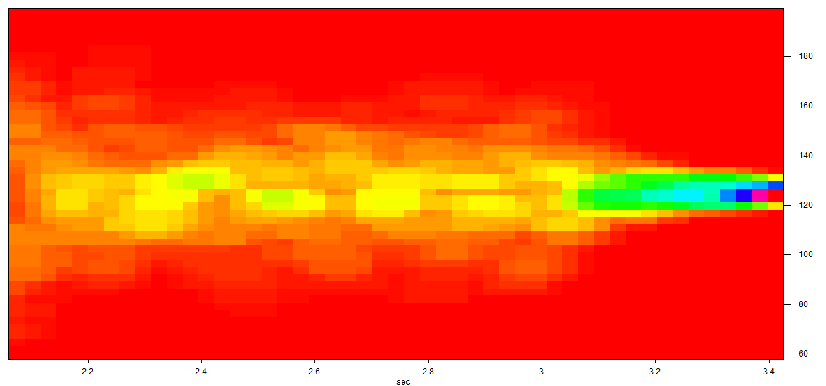
or like this if you switch your 3D window to "Spectrogram view" mode:
7. By using a combination of 3D-cursor and cursor extraction options, you can even use this graphic to restore each of the columns to a 2D graphic again.