Signal Display Options
SIGVIEW provides a variety of customizable display styles for visualizing signals, allowing you to tailor the appearance based on the type of data you're analyzing and your visual preferences.
All display options are available through the main menu, context menu (right-click on the signal window), or in the toolbar.
![]()
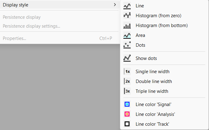
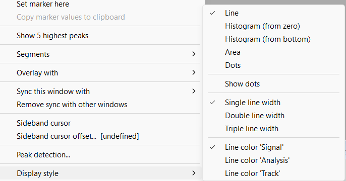
Line type
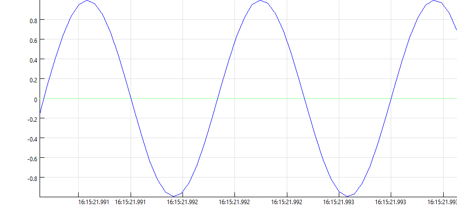
By default, SIGVIEW displays signals using a single-width line, which is optimized for speed and is recommended when working with large signals or real-time data.
However, you can choose from several display types to better suit your visualization needs:
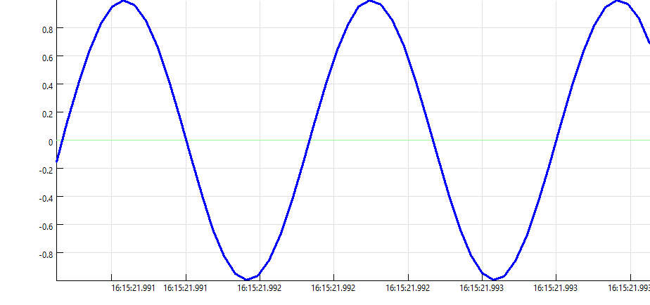
Line: Displays the signal as a continuous line connecting all data points.

Histogram (from zero): Draws a vertical rectangle (bar) for each signal value, starting from zero. Useful for: Low-resolution signals, Histogram-like plots, Probability distributions.

Histogram (from bottom): Similar to the above, but each bar starts from the minimum value of the signal instead of zero. This can be useful for signals that do not cross the zero line.

Area: Fills the area between the signal and the zero line, creating a shaded signal representation.

Dots: Draws individual dots at each data point in the signal.

Combine Dots with Other Display Types: You can choose to show dots in combination with other display types (Line, Histogram, or Area). This highlights the exact sample positions while preserving the overall signal shape.

Line width
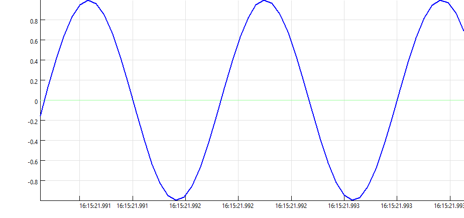
You can increase the thickness of the signal line to enhance visibility or emphasize certain signals.
Available options:
oSingle width (default, fastest)
oDouble width
oTriple width
Line color
SIGVIEW provides three predefined color types for signal display, depending on the type of data:
•"Signal" Color (Light Theme: Blue, Dark Theme: Cyan)
•"Analysis" Color ( Light Theme: Red, Dark Theme: Orange)
•"Track" Color ( Light Theme: Black, Dark Theme: White )
These colors can be selected via the toolbar or context menu and help distinguish between different types of data or stages of analysis.